
Walmart
Guide
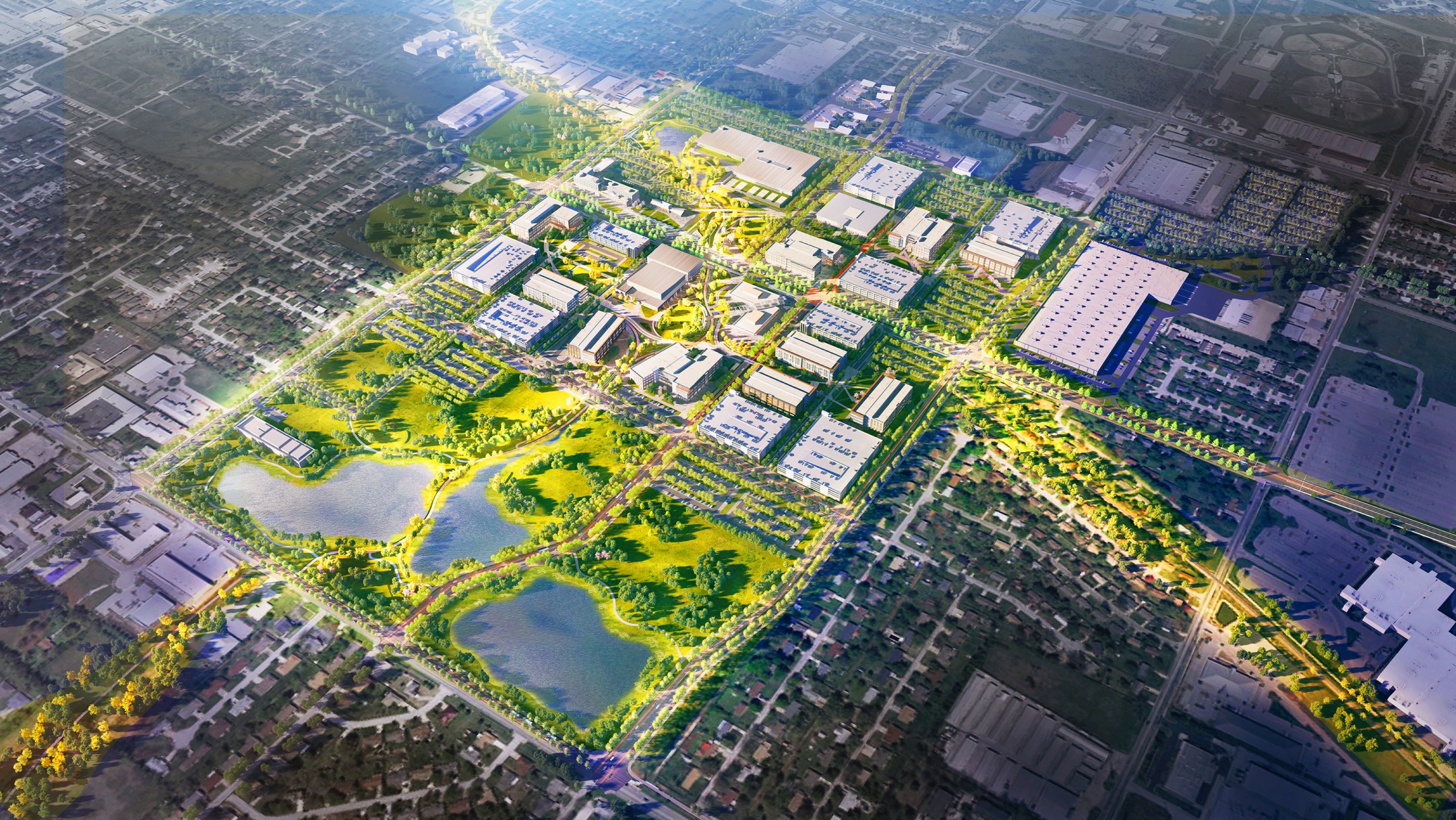
Project Overview
Navigating Walmart's corporate campuses can be challenging for associates, visitors, and vendors. A wayfinding app for corporate campuses worldwide enhances navigation, improves accessibility, and integrates seamlessly with corporate systems.
My Role
Lead Designer
[Team of 6 UX designers]
[Team of 4 UX Researchers]
Services
[Human-Centered Design]
[User Research]
[Headless Wordpress]
[B2B]
[Interaction Design]
Status
🚢 Shipped
How might we…
Decrease the time it takes an associate to find and book a room?
Remove unnecessary stressors from an associate's daily campus life?
Provide every associate with the option to easily find a destination on any Walmart campus?
What is Guide?
An ecosystem of technology that links together sought-after features across multiple products to aid associates, contractors, and visitors in navigating our corporate physical space.
What technology should we use?
As the project was kicked off, one of the major concerns was what technology should be used. Kiosks were cheaper, had a pre-determined CMS, and took less development time. Quickly, we updated the CMS to match Walmart and began testing with 29 different associates.
Key Insights from Testing
Associates lose their way every time they enter a new section of a building
Based on an associate mental model while navigating within a building, associates need mobile way-finding over kiosks
Initial Discovery
As we began to think through different pain points, we developed storyboards to validate with associates. We then took the storyboards and made quick wireframes of potential screens. After meeting with 12 users, these were the key insights.
Key Insights
Smart search and instant room booking were prioritized by all associates
Associates in satellite buildings need to be self-sufficient when booking a room


Journey Mapping
As we started to synthesize all of the research, we mapped out the current steps a user takes to set up a meeting. This allowed us to identify specific opportunity areas where Guide could provide improvements.

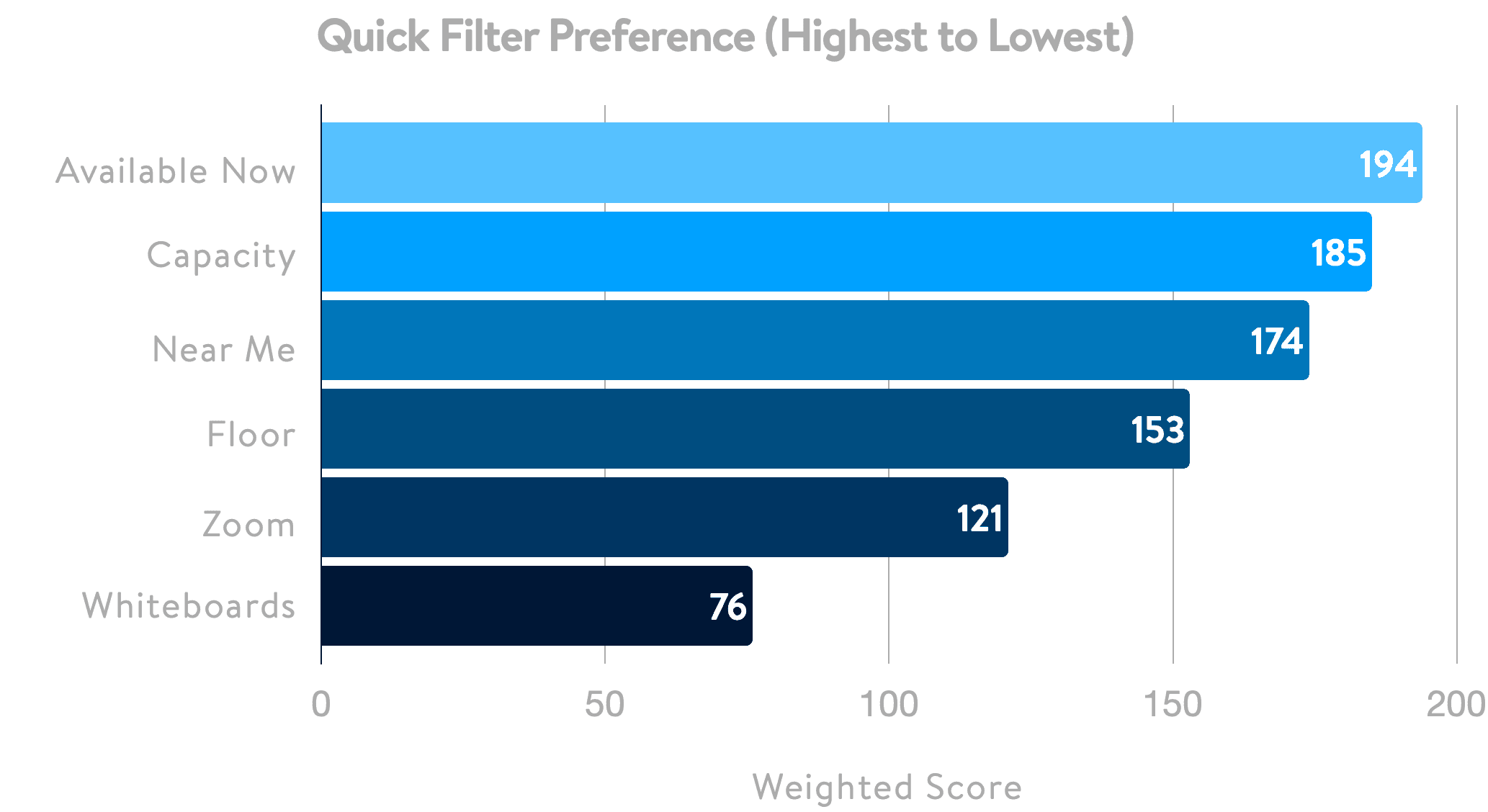
What are associates looking for in conference rooms?
We sent out an additional survey to capture associates’ attitudes toward conference room needs. We wanted to understand associates’ top preferences for filters when searching for a conference room.
Key Insights
Book on the same floor as their desk location
Screen sharing capabilities are a standard expectation
Opportunities
Would like reminder alerts for canceling unused rooms
Filtering by time allotment (30m, 1hr, etc.) is valuable
Information Architecture
Based on previous research, we started designing an architecture that aligns with associates' expectations and priorities.
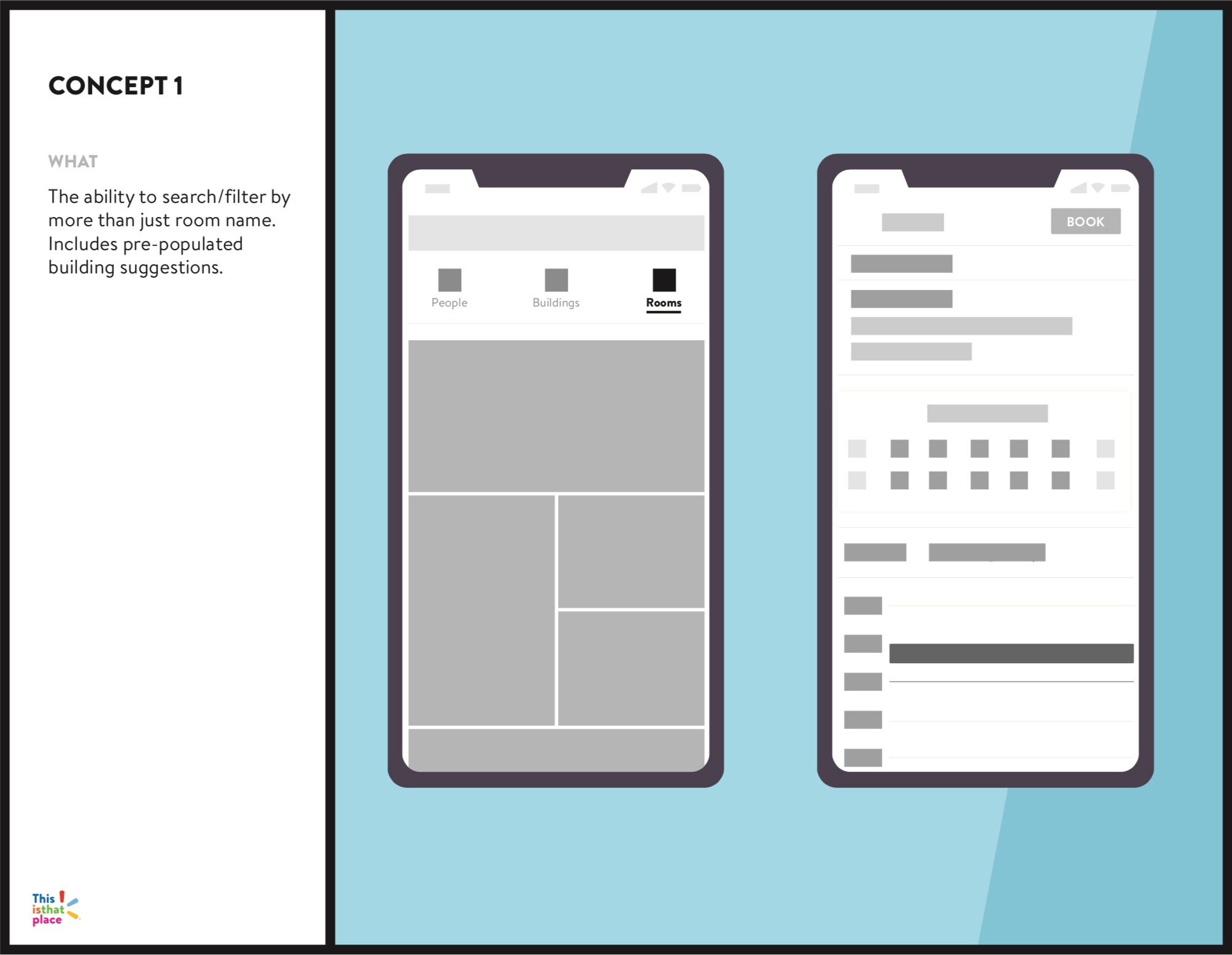
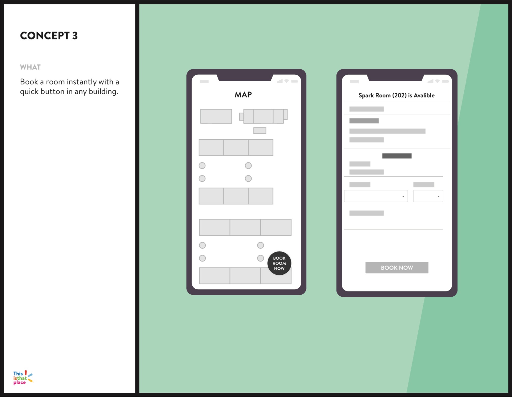
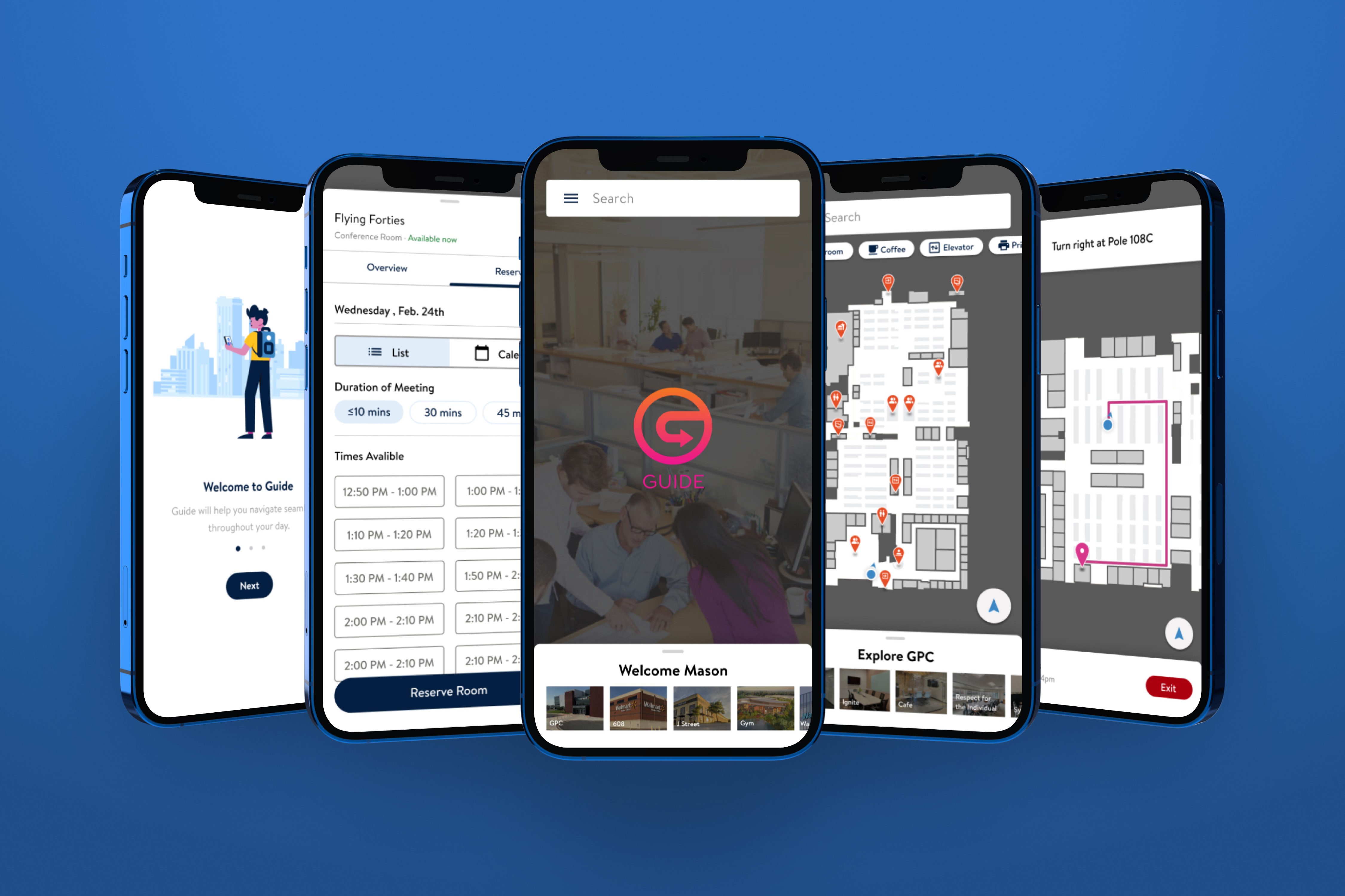
Final Designs
Initially released on iOS and Android, the app launched with four user-requested features. Following the launch, we retested all features to measure success against the pre-defined baselines established in earlier research.
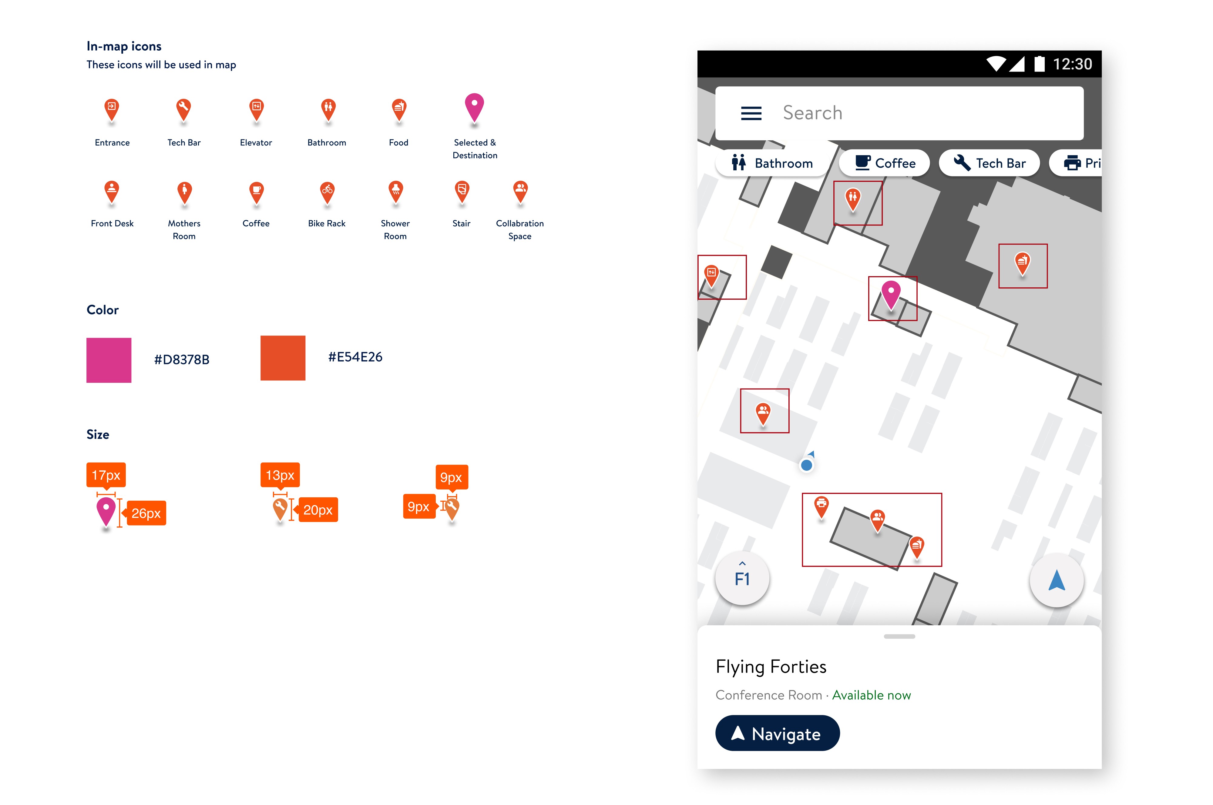
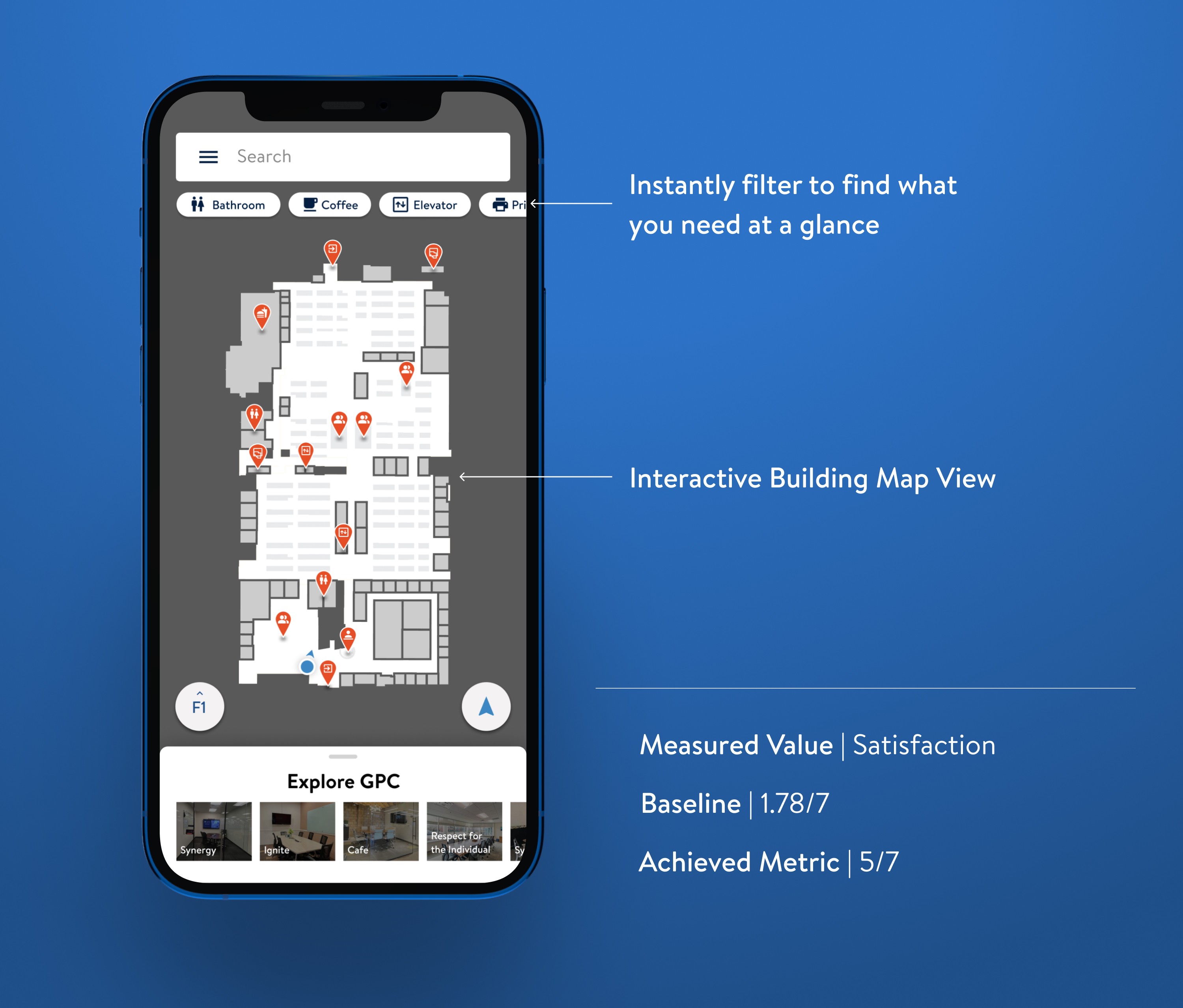
Map Design
This is a view of a handoff we conducted with the development teams. It explains the usage of icons on the map vs filtering due to different map CMS parameters.

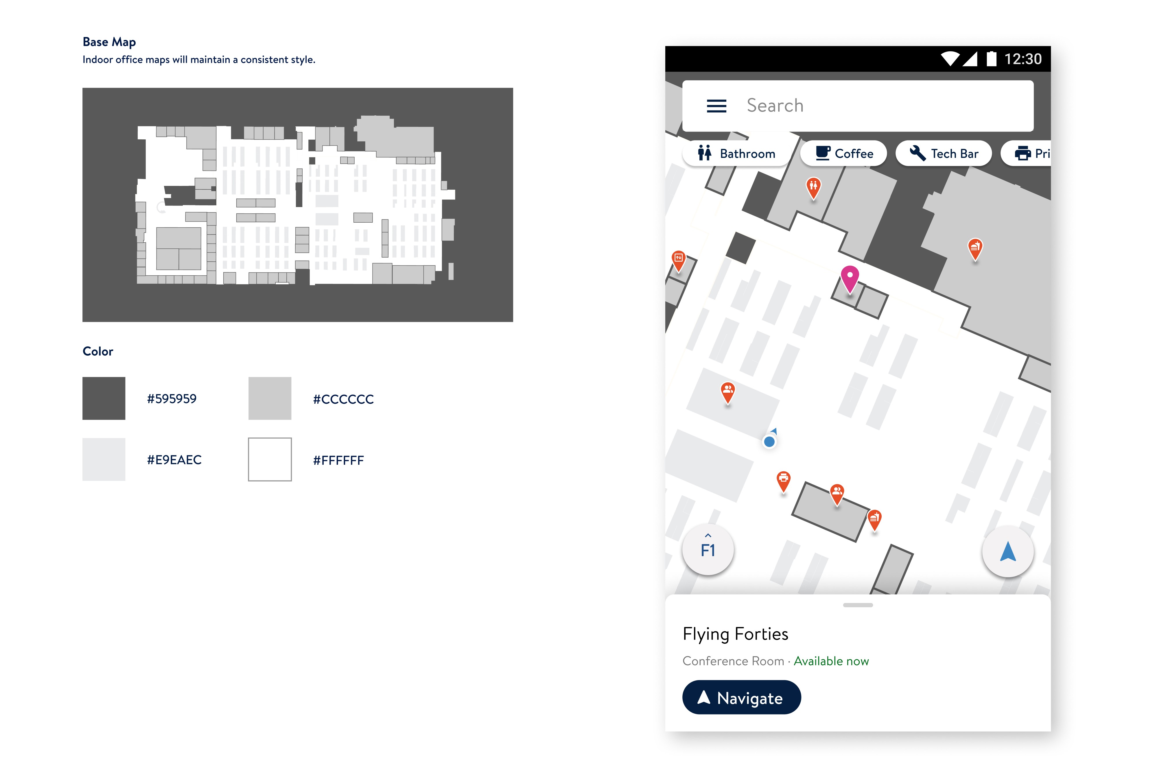
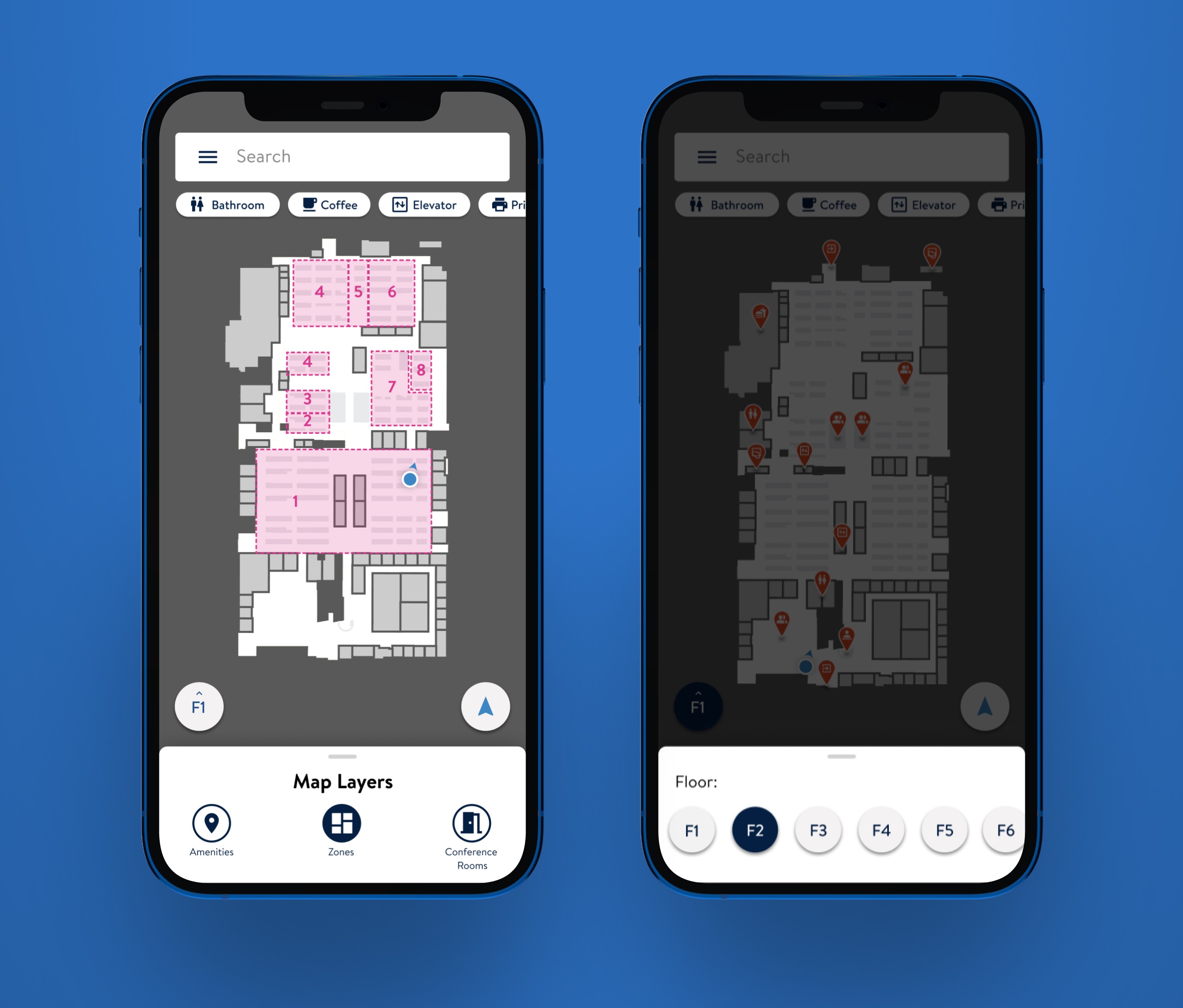
Map Theming
With the introduction of interactive maps, point-of-interest filters, different map views, and floor-to-floor navigation, we were able to revalidate against our existing benchmarks. Zone layers and floor-to-floor navigation were two net-new features that were not part of the initial release but were fast follows. Net-new features went through additional usability testing following initial release.
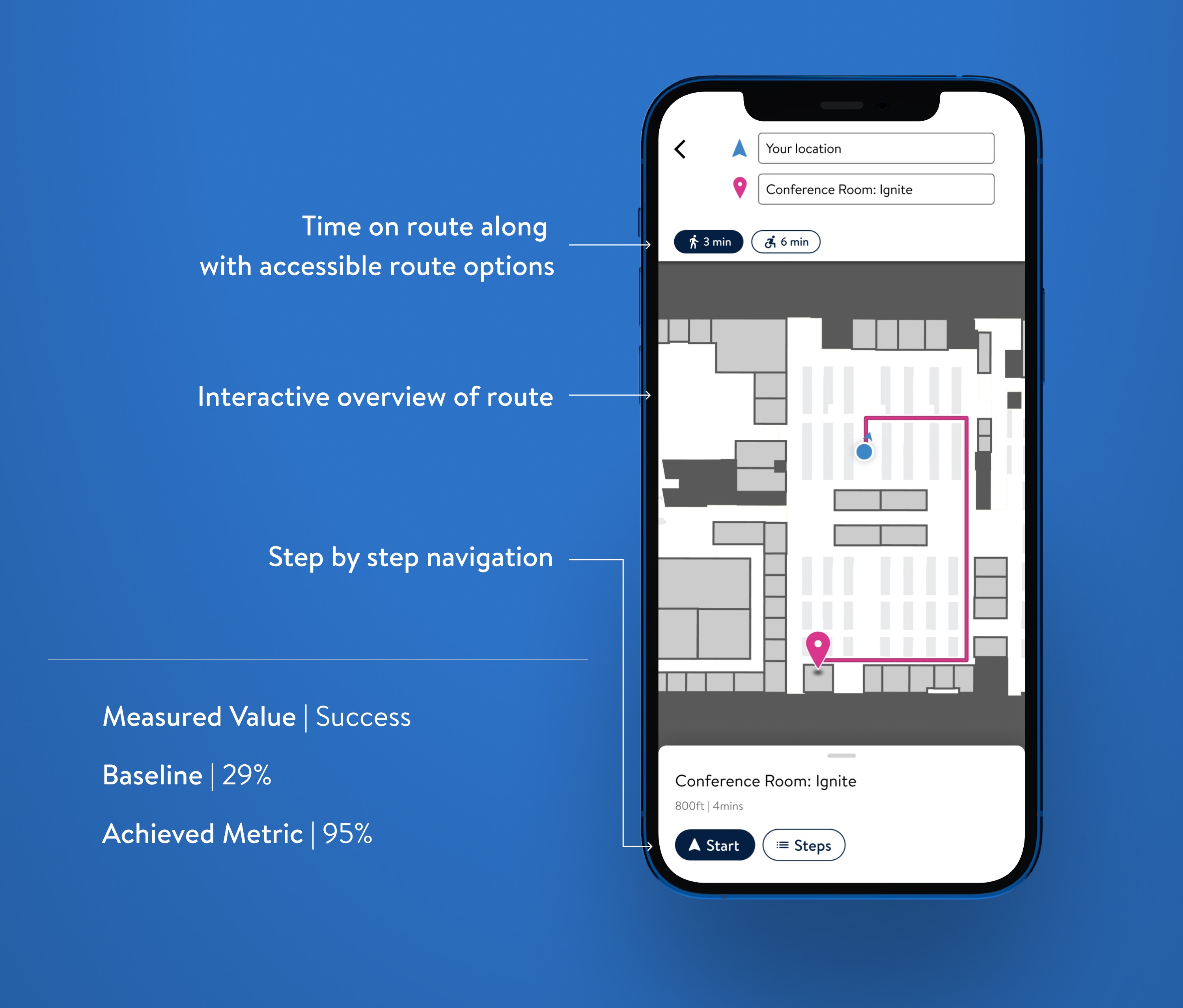
Navigate to a room
Users receive precise, real-time directions, reducing the time spent searching for locations. Guide makes it easier to find meeting rooms, amenities, and colleagues.
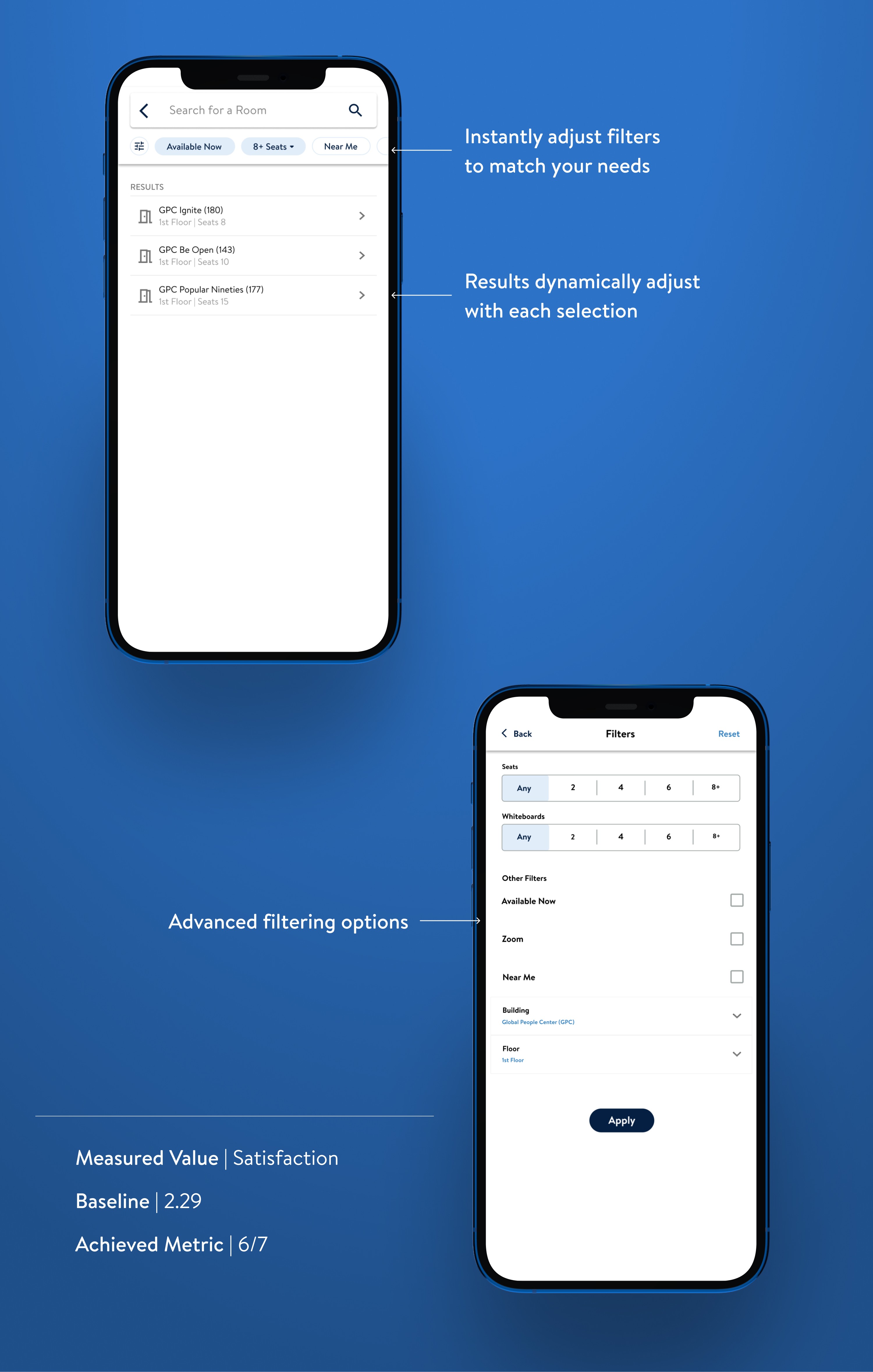
Smart Search
Users can quickly find and book rooms equipped with necessary amenities like number of seats, whiteboards, or video conferencing tools. This targeted search capability streamlines the booking process and enhances overall meeting productivity.
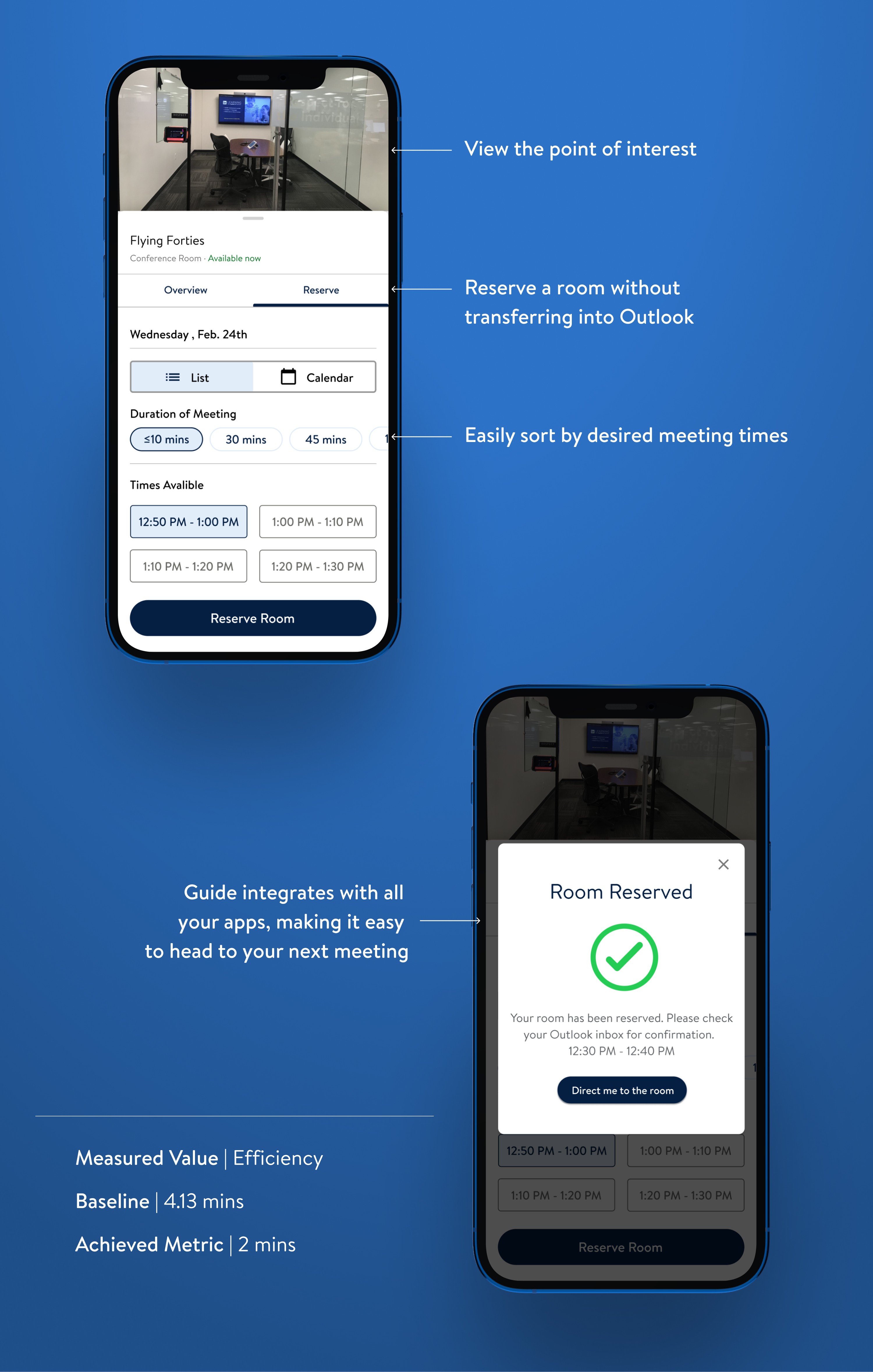
Booking a Room
Guide seamlessly integrates with Outlook, enabling users to reserve rooms all within the app.
Reflection
What I learned
Building an app across a global scale takes a village
Working across numerous Walmart campuses led to various intricate challenges. Engaging with different teams, identifying technical constraints, and having a comprehensive understanding of possibilities at the project kickoff were crucial.
Testing can be scrappy
Initial testing for this project faced numerous technical constraints. Despite these limitations, engaging with users and employing traditional pen-and-paper prototyping revealed an equal number of key user issues.
Working across time zones can be tricky
Working across different time zones presented significant challenges, such as coordinating meetings and ensuring real-time communication between the design and development teams. Clear documentation, async meetings, and rotating meeting times are key tools for improving collaboration.
Next Steps