
USAA
Confirmation Experience
Project Overview
To better educate members about the many ways they can utilize their new checking account's features during the first 45 days of account opening priming the member to deepen with USAA.
My Role
System & Interactive Designer
[Team of 4 UX designers]
Services
[Human-Centered Design]
[User Research]
[Service Design]
[End-to-End Experience]
Status
🚢 Released MVP in 2022
Our Challenge
Members are presented with all the options to get their accounts started, but they aren’t always ready to take action right away.
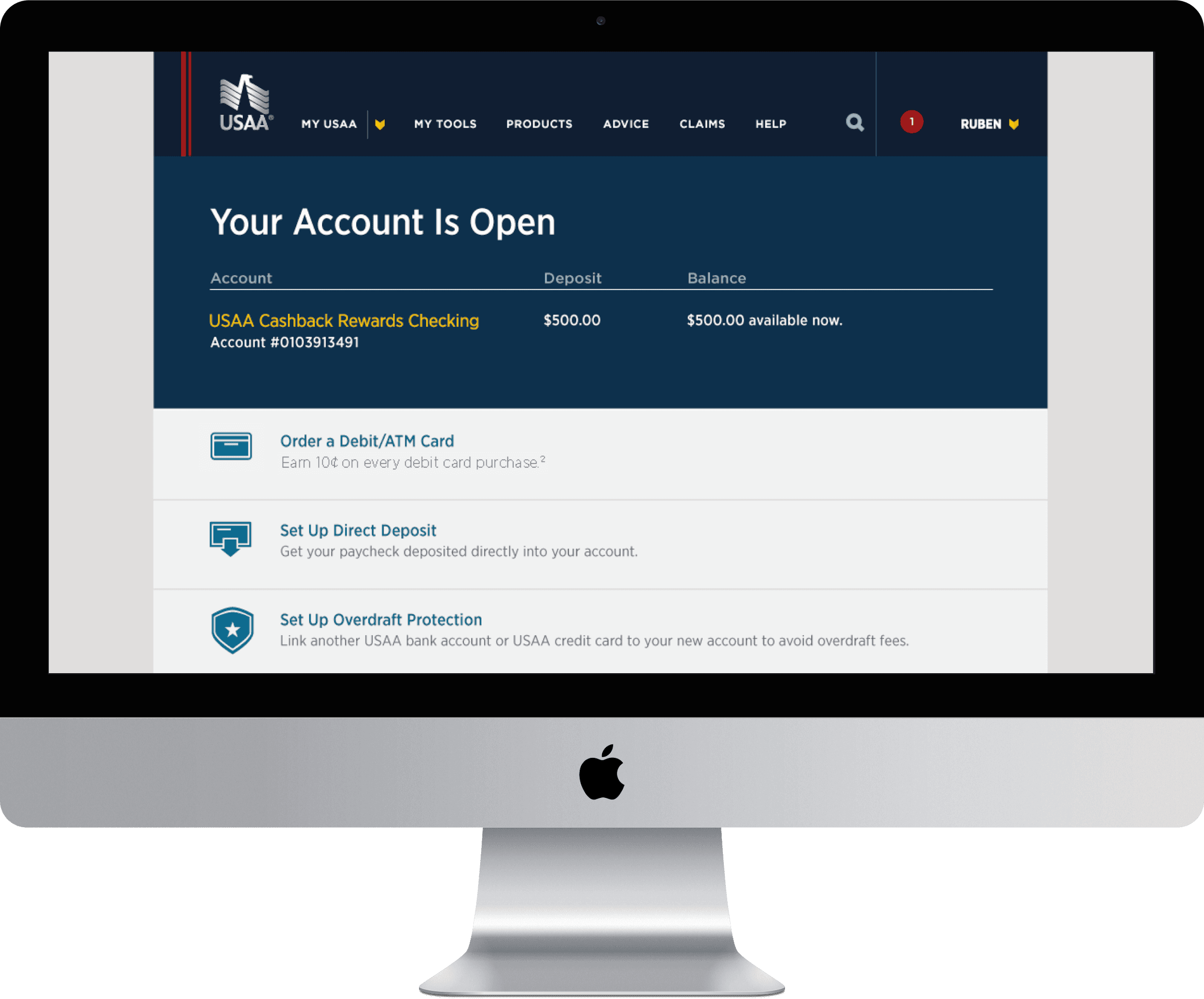
The first page a USAA Member sees after opening an account.
Less than 1/3 of Members take action on the Confirmation Page.
Members cannot return to this page after navigating away.
Just How Big of a Problem?
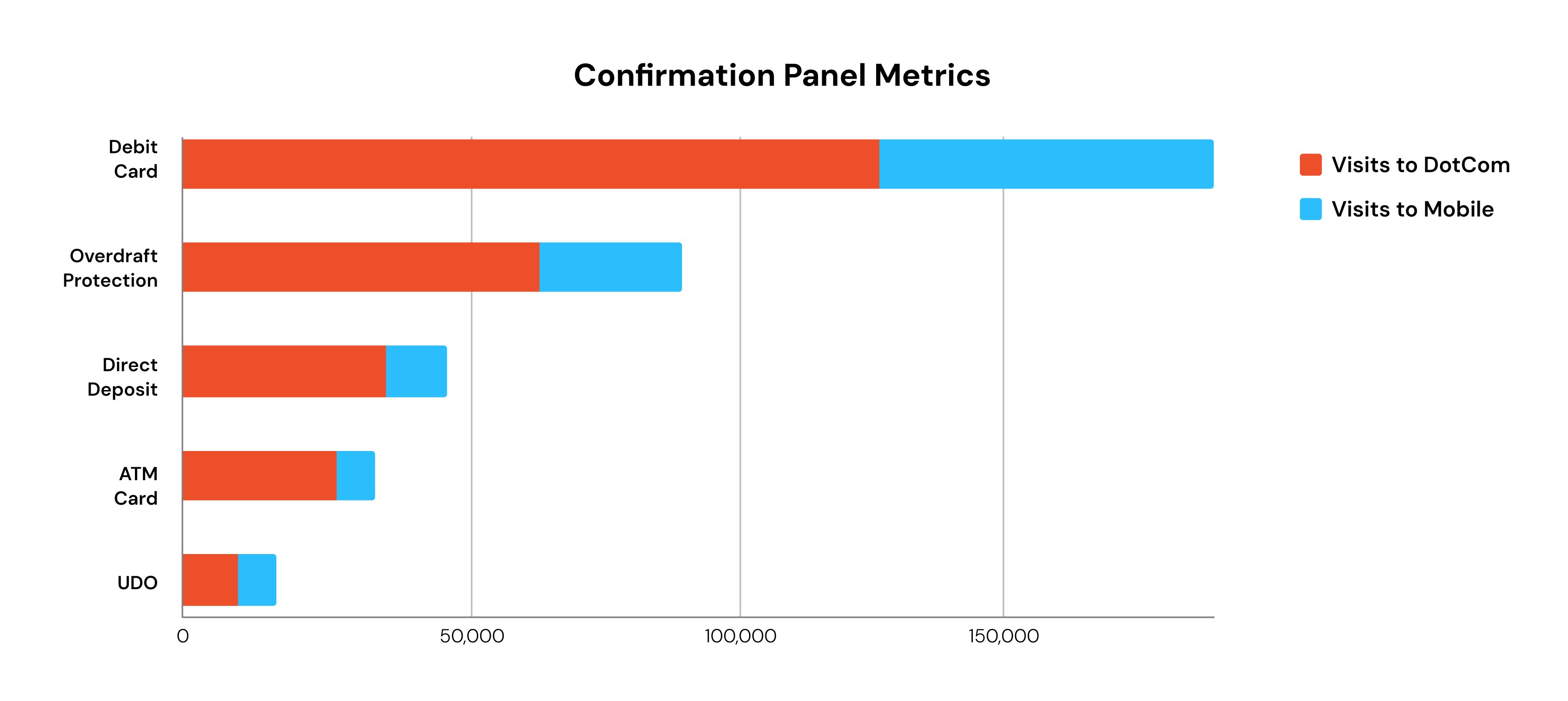
Of the ~204k total visits to the Confirmation Page of members who interacted with the page, these are the panels with the most visits:
51.3% Order Debit Card
25.2% Over Draft Protection (ODP)
12.2% Direct Deposit (DD)
8.8% Order ATM Card
2.5% UDO (Paperless Statements)
This data does not include panels with Offers, etc. as those panels will not appear for every member.
The top 3 panels for Checking were: Order Debit Card, ODP, and DD.
The top 3 panels for Savings were: ODP, ATM Card, and DD.
Let's Hear From Our Members
We conducted interviews exploring members’ attitudes toward checking accounts and members' Unboxing/Setup experiences after opening a new checking account. We wanted to learn members’ thoughts and general feedback around the page.
Do members recall seeing the Confirmation Page upon opening an account?
Do members find the Confirmation Page helpful? Why or why not?
Is there anything this page could do better?
The following common themes emerged from these interviews:
Most members did not recall the Confirmation Page. They were more interested in going to their account summary or doing other activities on the site.
Members expected to be able to return to the Confirmation Page (they cannot).
After opening a checking account, the things members want to do immediately or within a short time window have to do with card utilization.
Members do not perform tasks on the Confirmation Page simultaneously. Many of these tasks they are not ready to do immediately after opening an account.
What Our Members Had to Say

Rudy
The main thing is: Can we activate the card? Can we put money in [the account]? Alright let's buy something and do I get a notification immediately that I purchased something...?

Chris
I would have liked to know more about the features of the account, looking back. But I was, I guess, just more concerned about getting help… I just — I should have asked more questions. I would have liked to know more about other options or other features, add-ons, etc.

Shannon
I would rather be able to go online, but I will call if I have to. If I cant find something online, I call. I want to tell someone my specific situation and have them give me recommendations.
Behavioral Insights
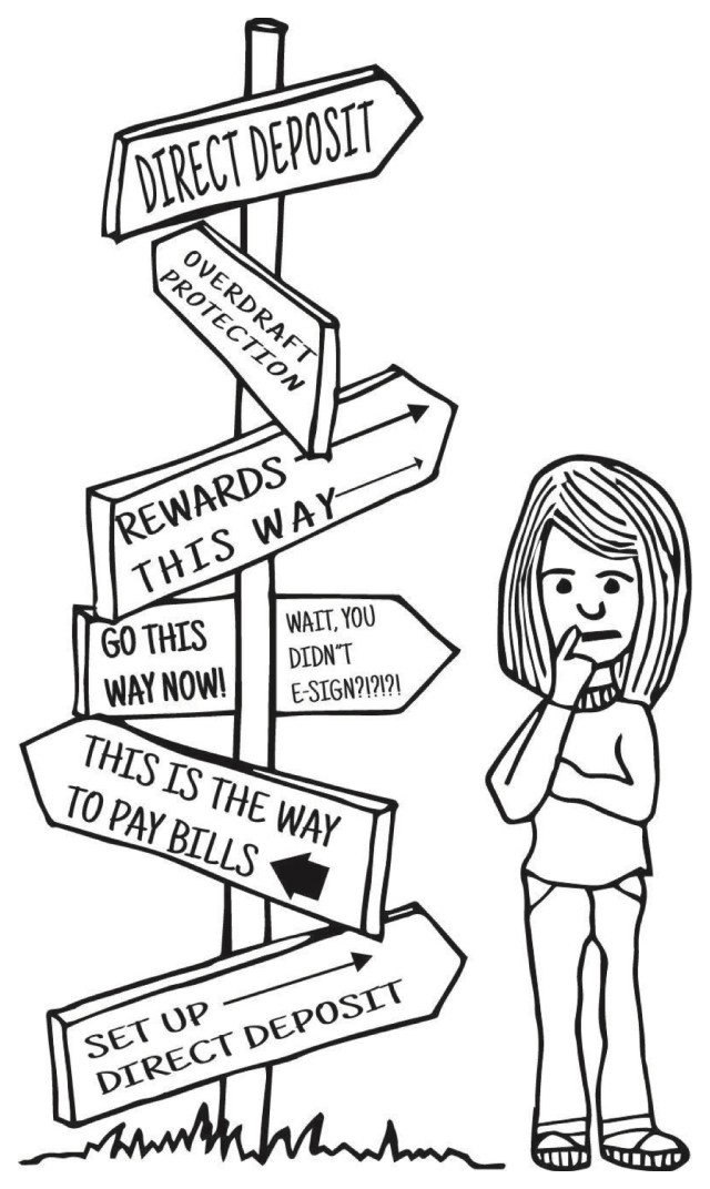
While important to the Members, the items on the Confirmation Page are not a priority when first setting up their accounts. Instead, Members focus on tasks related to utilization.
Members are unaware of the various features of their checking accounts and are not empowered to learn. This leads them to feel lost and overwhelmed when trying to set up their accounts.
Members are often not ready to complete every task presented to them on the Confirmation Page and desire a more personalized experience that allows them to control how they set up their accounts.
Value Statement
Members new to checking will be educated on their checking account, based on their circumstances, so they can have confidence when using their card and spending their money.
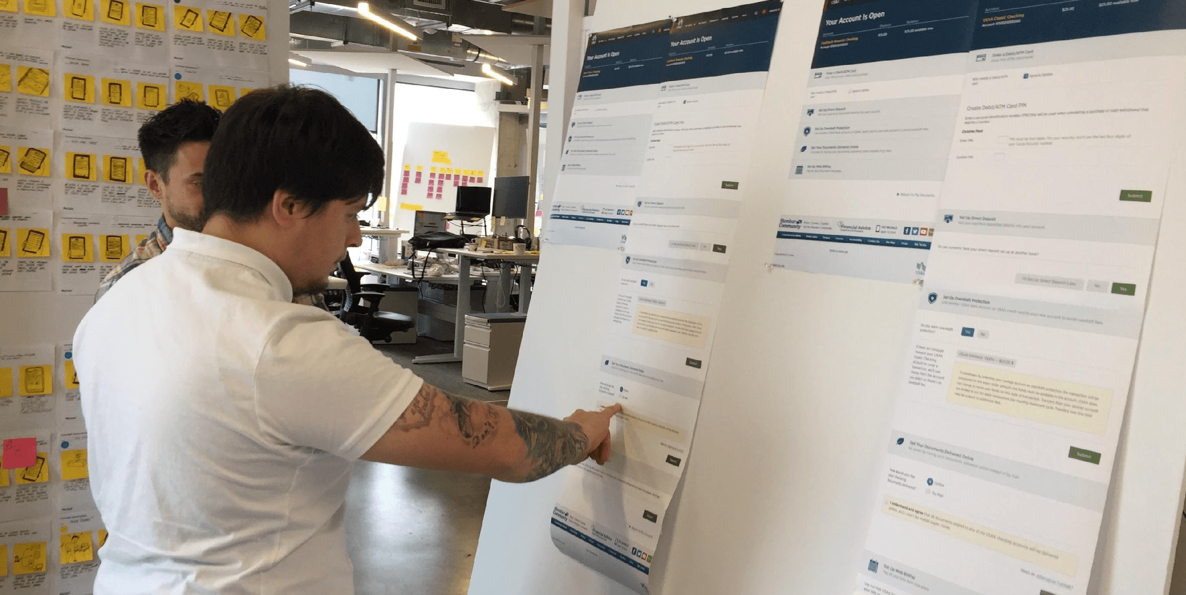
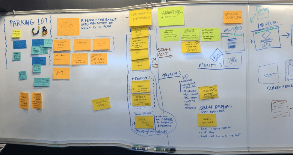
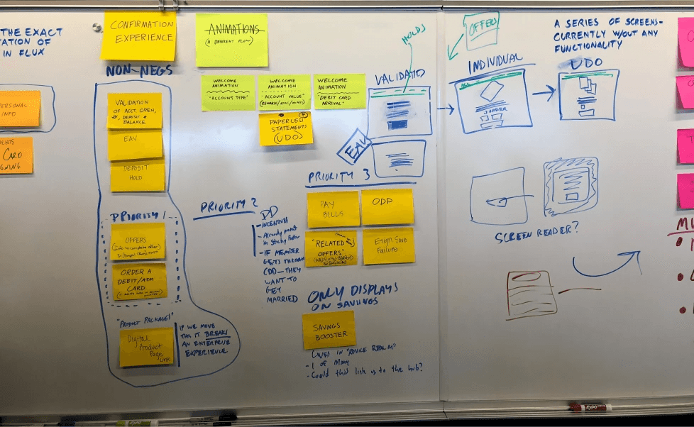
Initial Concepts
We met with the additional design teams, customer experience team, and multiple SME's to sort the various account set-up tasks into the different areas of the Acquisition and Unboxing experiences. We color-coded stickies and separated them along the 45-Day journey of a new checking account to identify opportunities to surface the set-up tasks at better times for the members. Our goal was to create a cohesive experience from EDA to Unboxing that balanced business needs and requirements with those of the members.
Wireframes
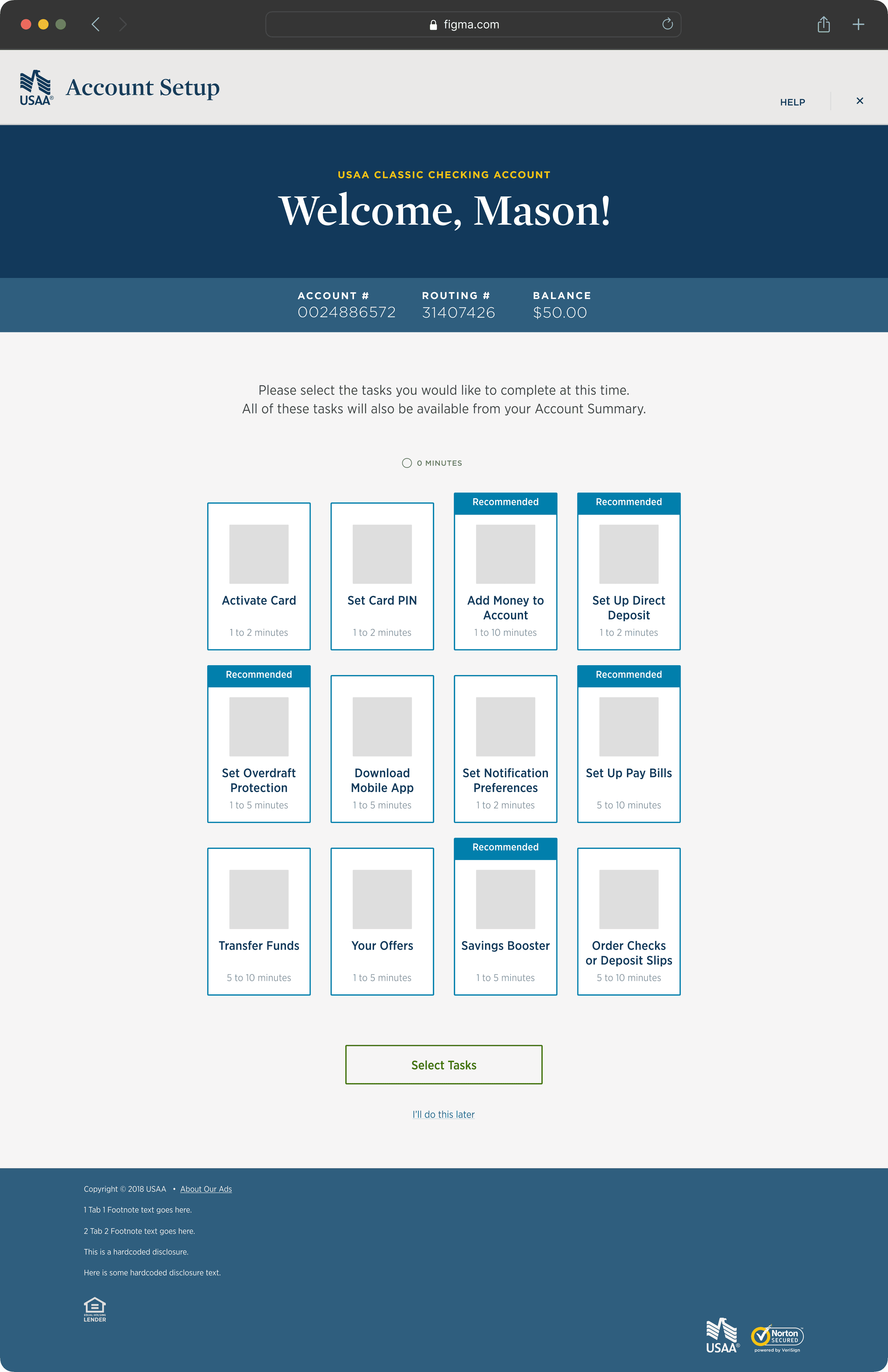
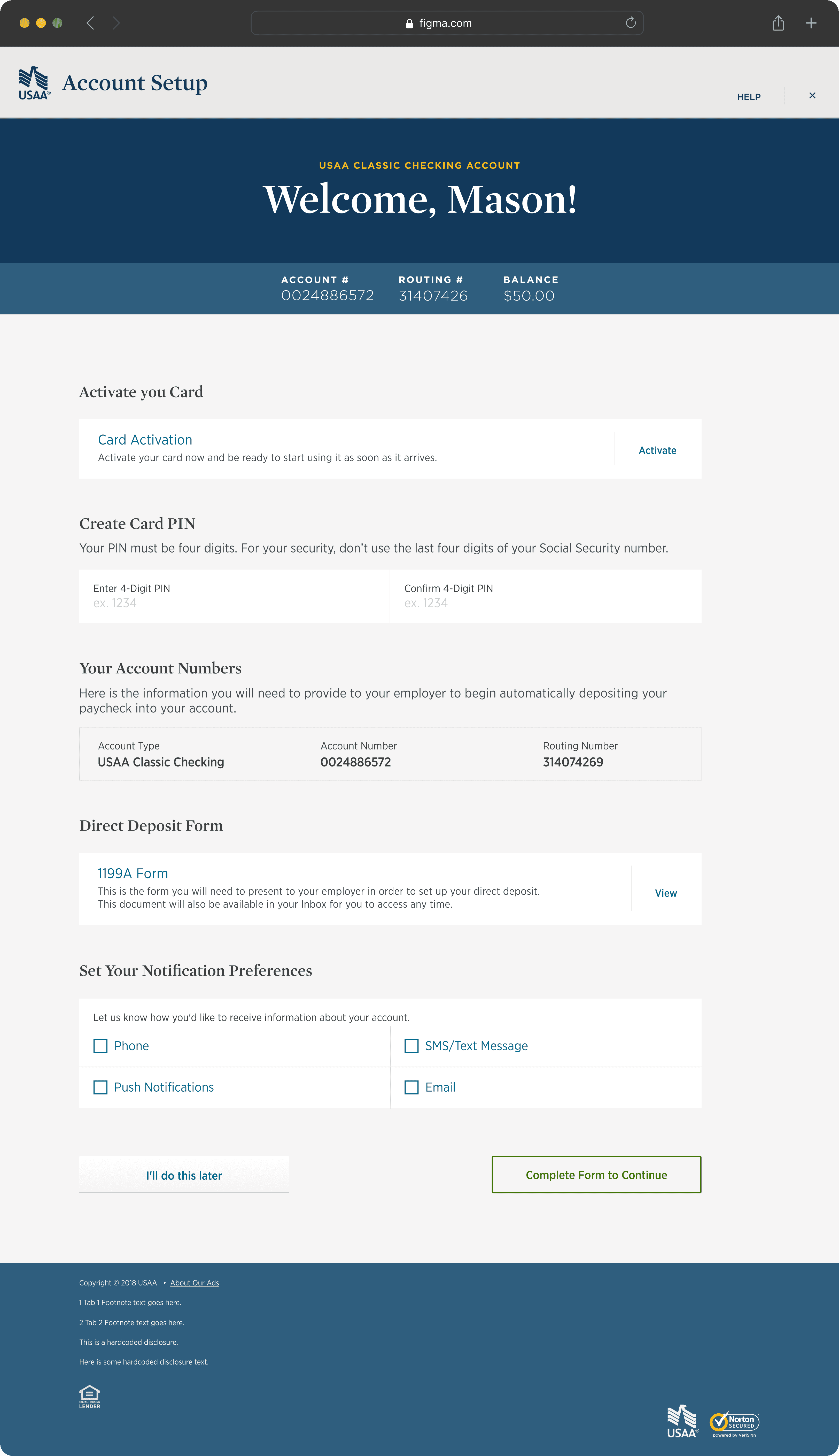
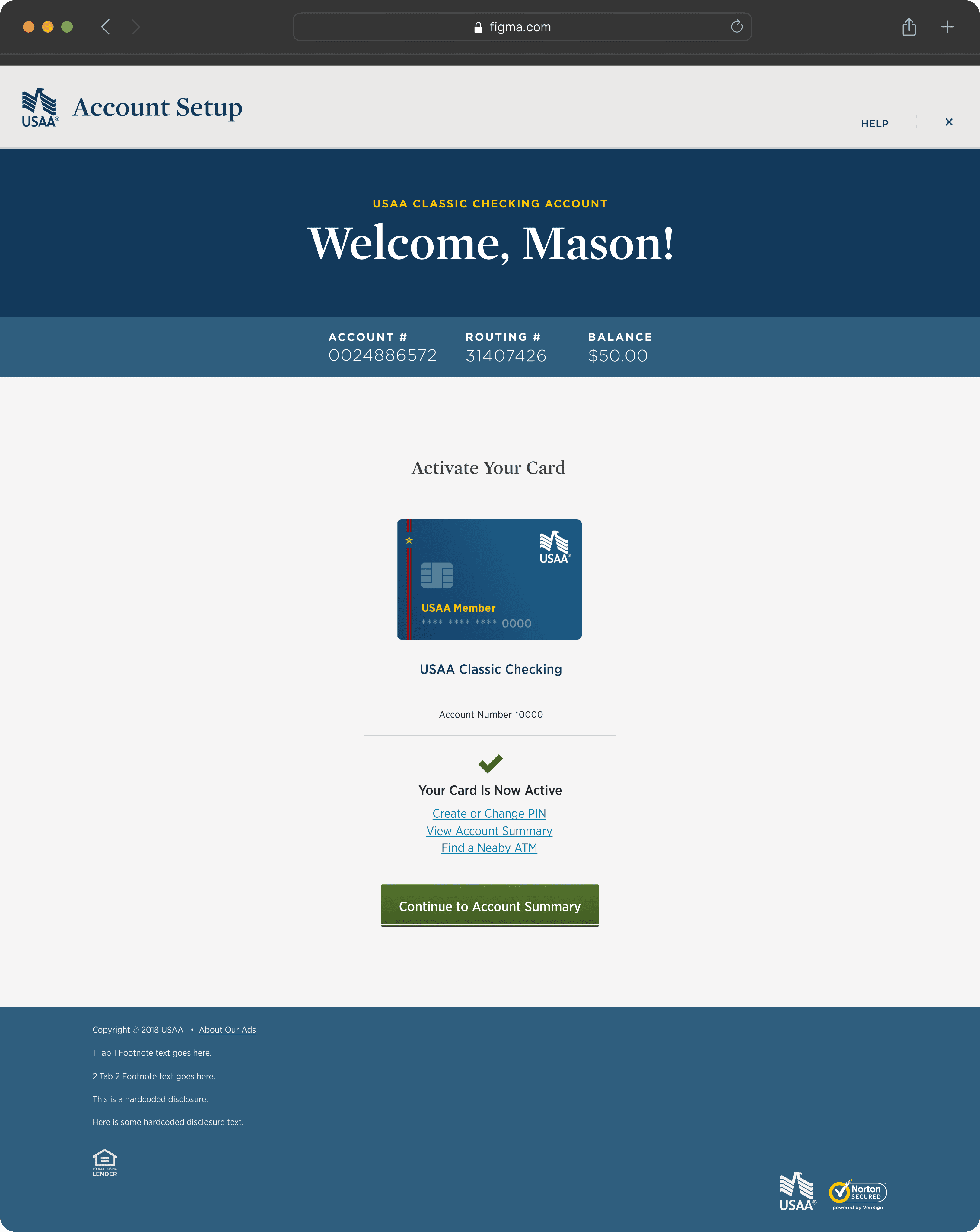
The goal of the Confirmation Experience is to provide a central location with explanations of the various ways in which a member can add money to his/her account and to provide recommendations for those methods based on member engagement and input.

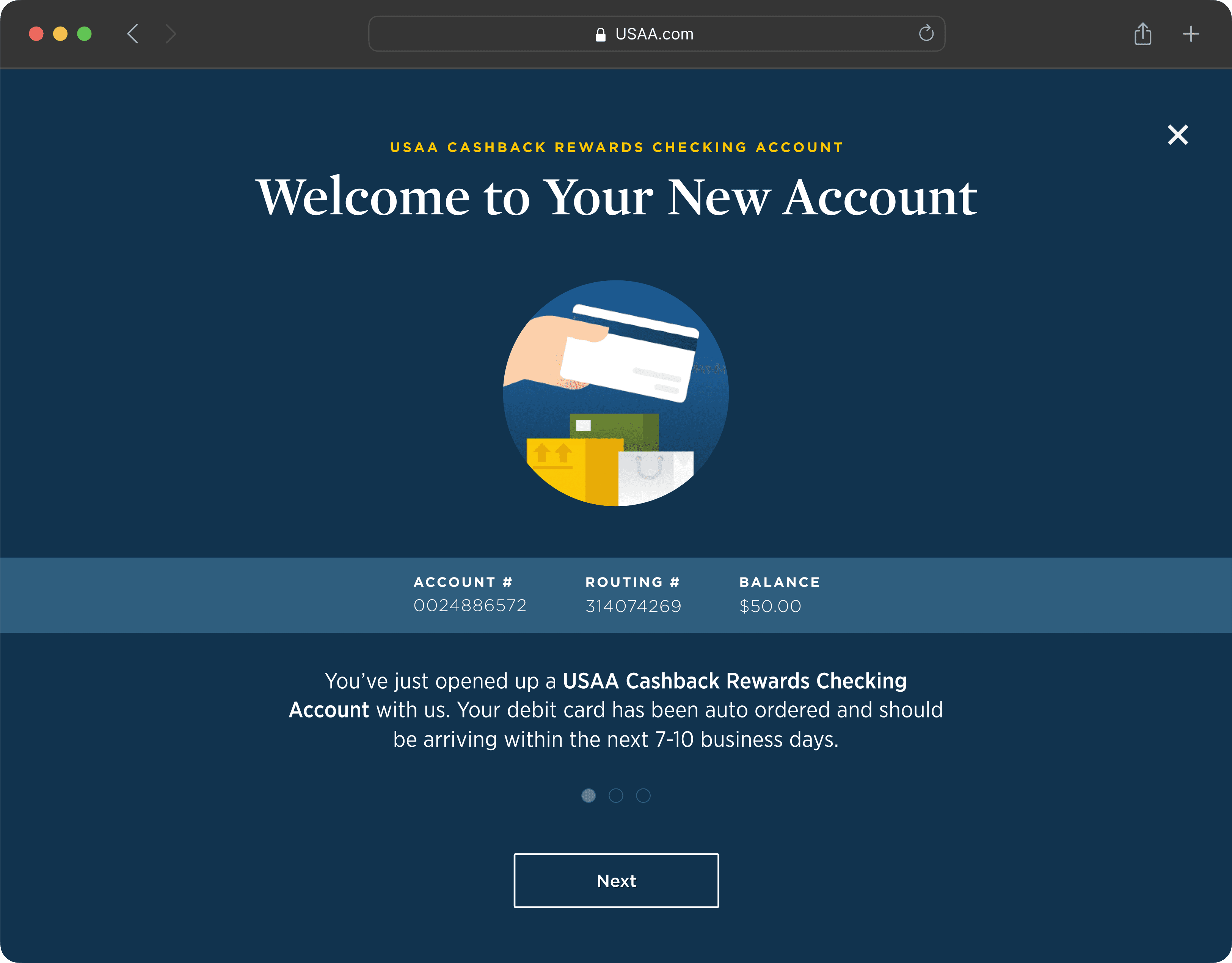
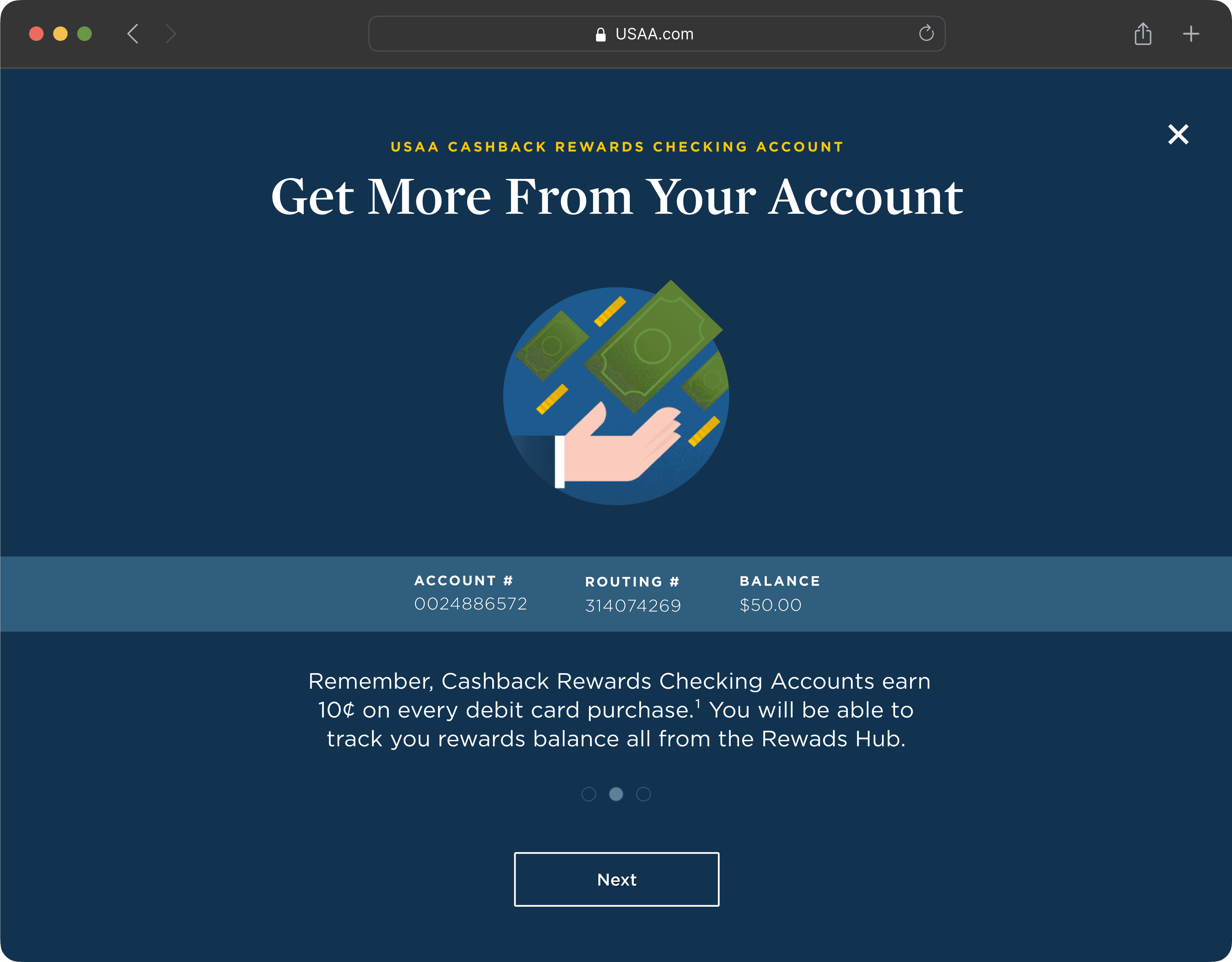
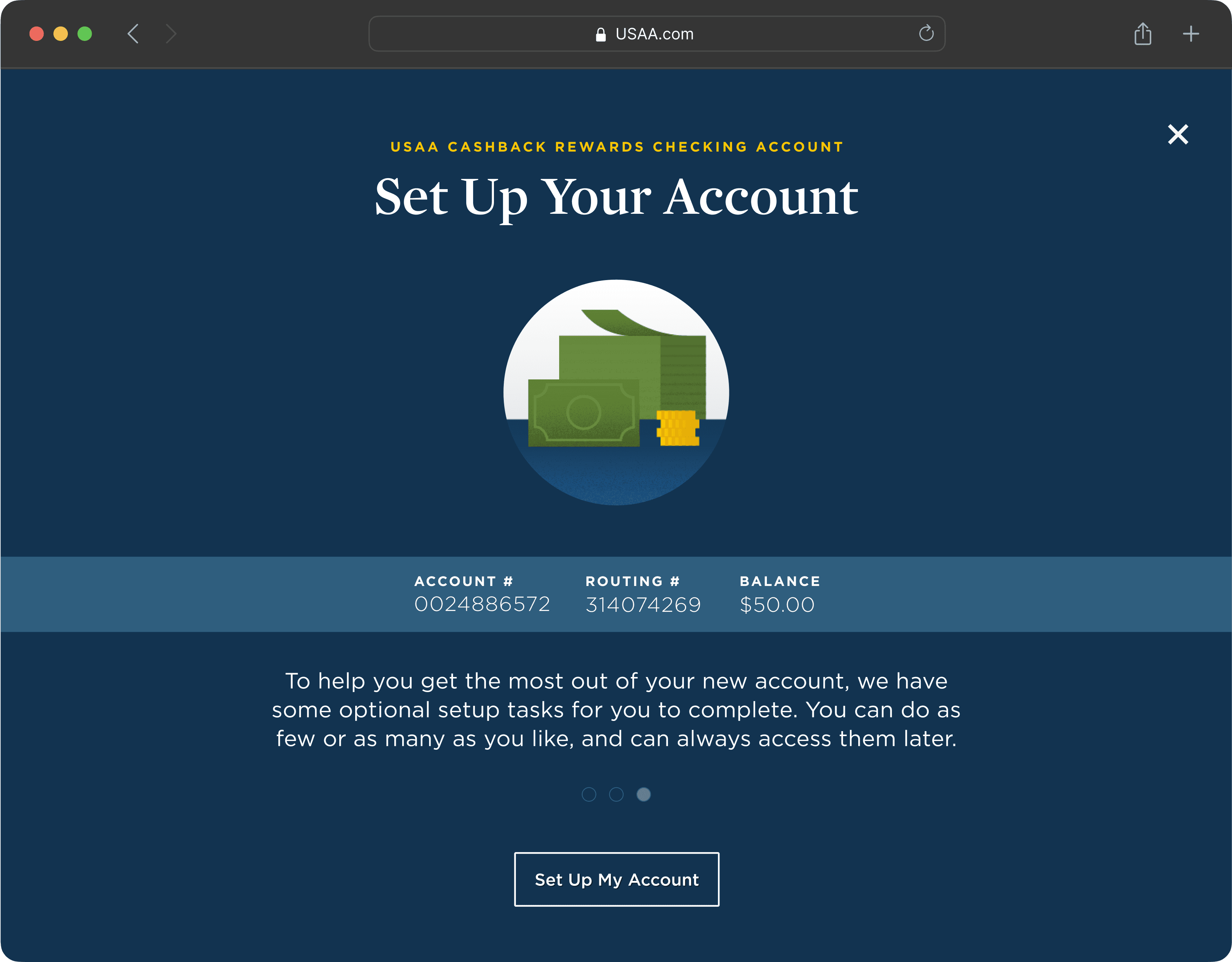
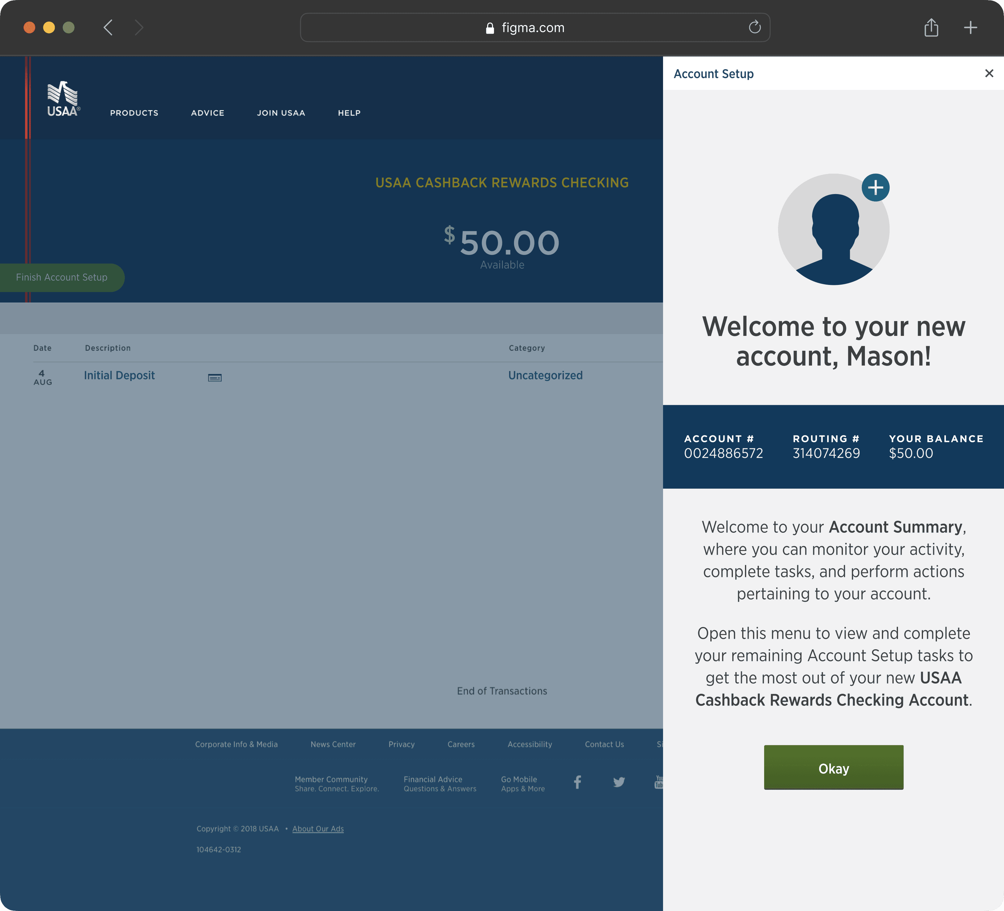
Welcome Interstitial
Members are shown their account number, routing number, initial deposit, and reiteration of the specific benefits of their account. The welcome interstitial validates that the account is open and serves as a small celebration along their account journey.
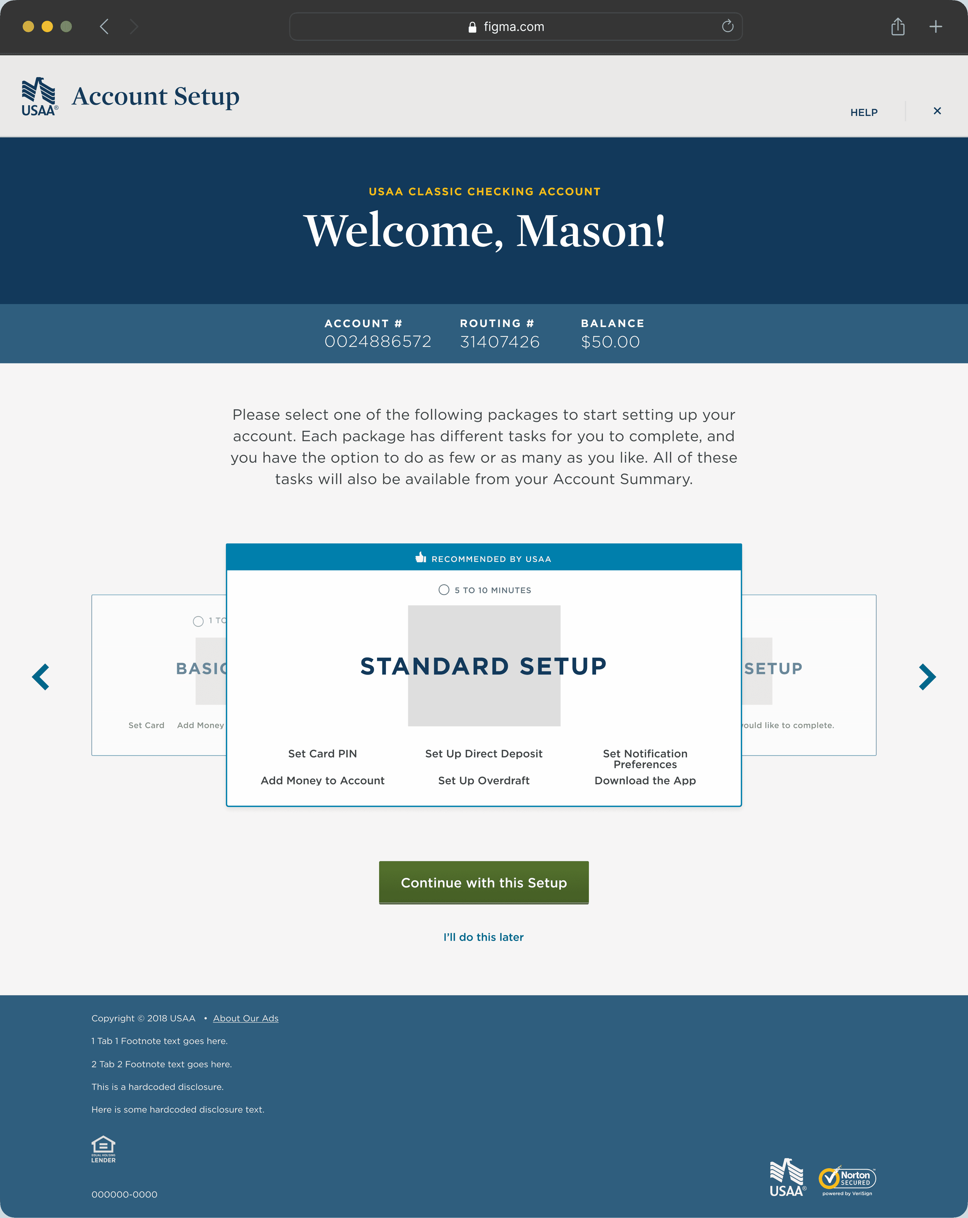
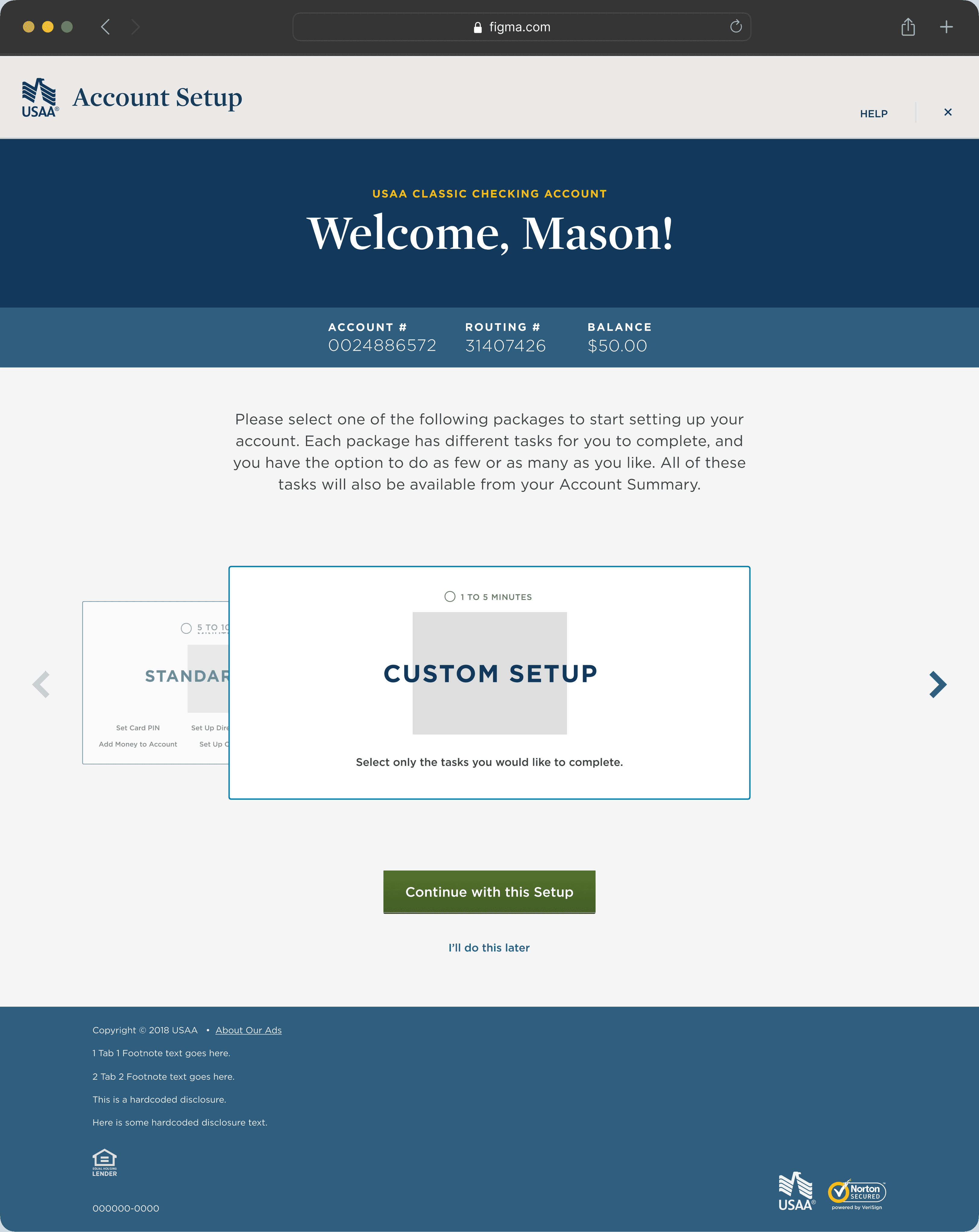
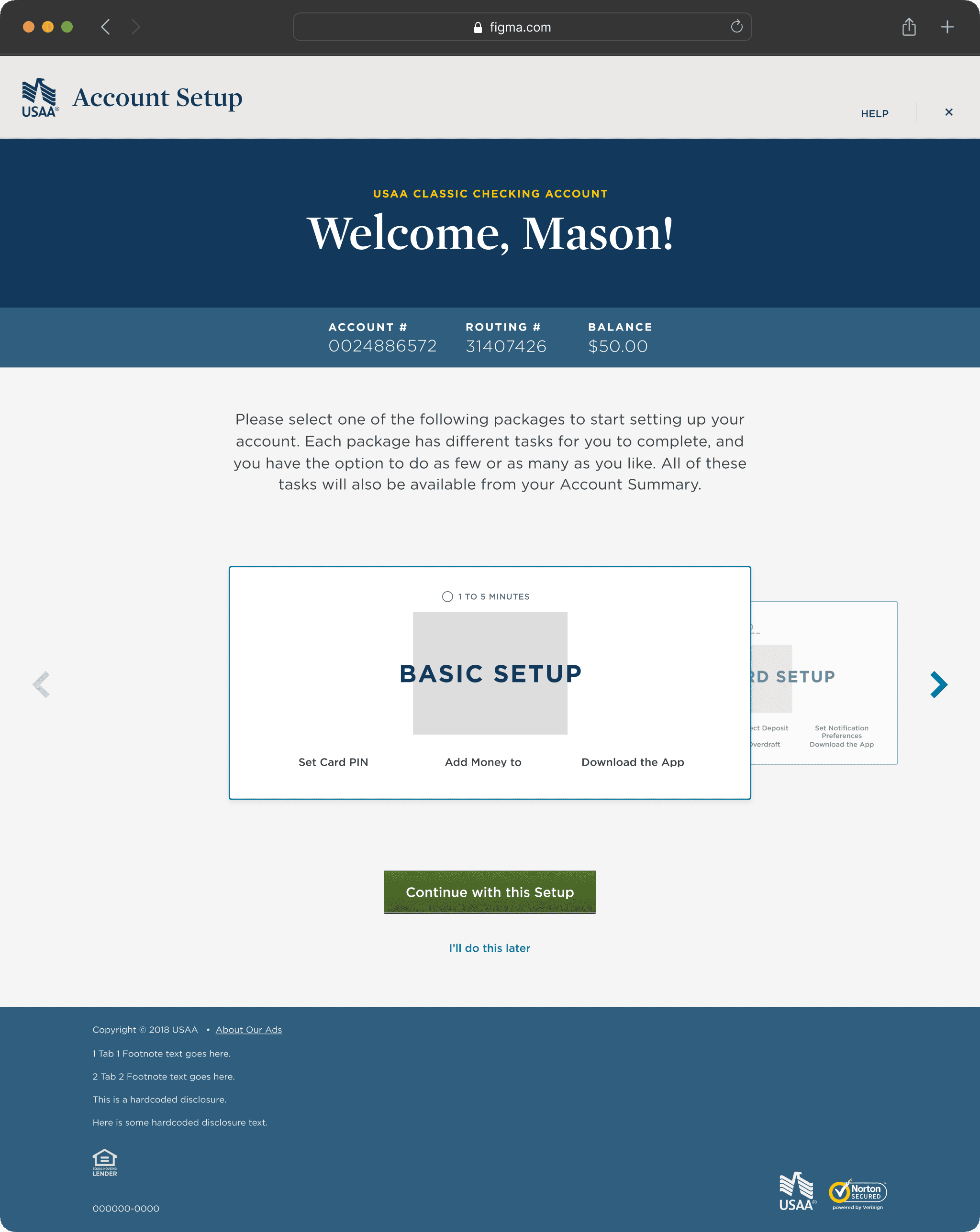
Packages
Members seek guidance and customization of their checking accounts based on their different needs. Optimized, data-driven packages recommend personalized sets of tasks to each member.
Updated Forms
Members can take action on different tasks based on their preferences. Nothing is mandatory, members can spend as little or as much time to meet their account goals.
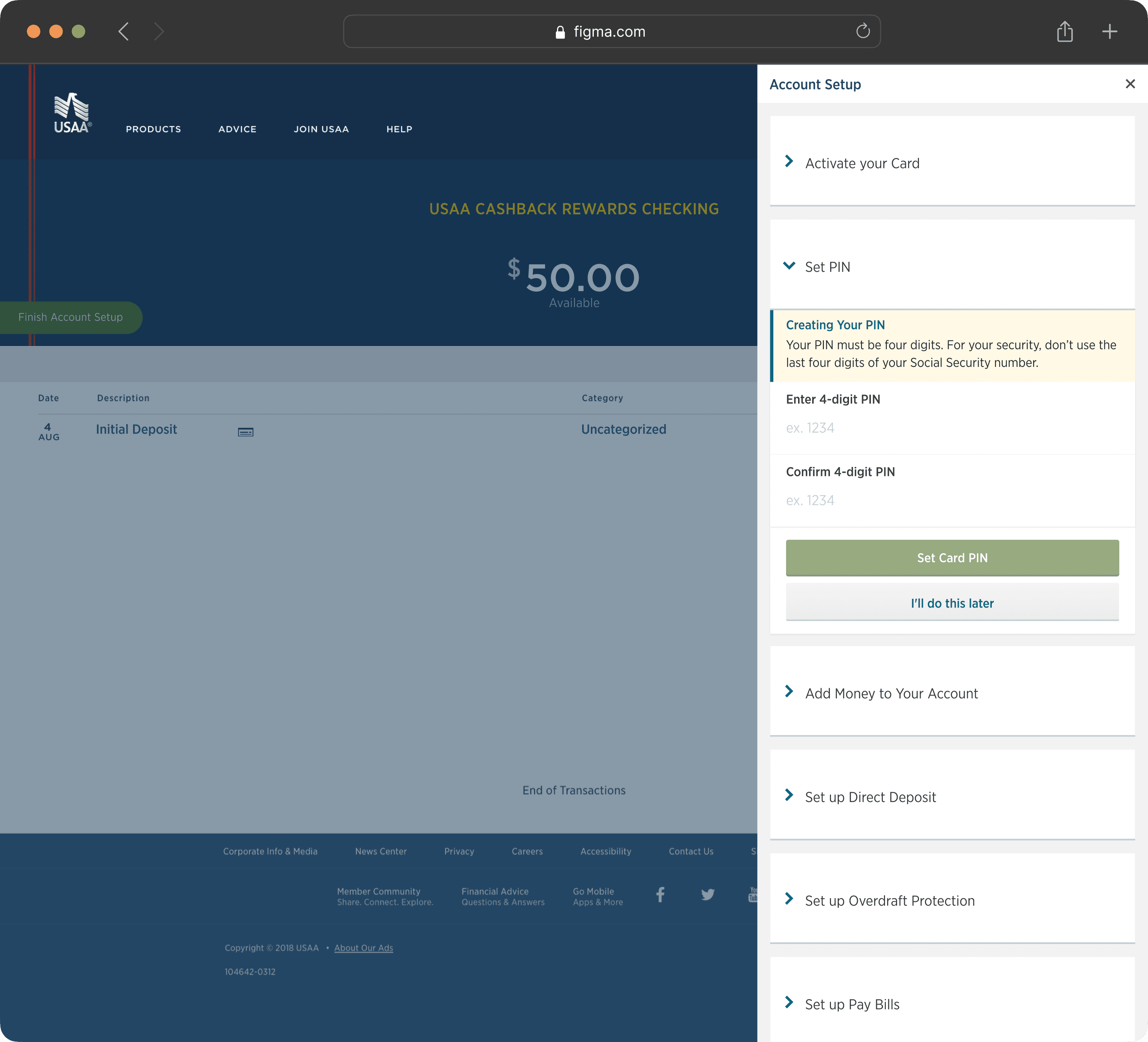
Sidebar Experience
Members can complete a multitude of tasks. Defining a specific area to help members achieve their goals within the first 45 days is crucial to getting the most out of a new account.

Reflection
What I learned
Balance business needs with user needs
With so many partners along this journey, it was difficult to balance different perspectives, opinions, and requirements. By heavily relying on user-driven insights, the team established a solid foundation to align/prioritize specific needs.
Synthesizing data is crucial and takes time
No matter how many users you interview or how many tests you run, some insights will still be left behind. Allotting a time frame and removing personal bias as much as possible is key to defining insights.
Bring partners in early and often
The number of touch points along this experience had massive implications for our organization. We established a "traveling showcase" in a sense where other teams could get up to speed at any point during the design process.
Next Steps